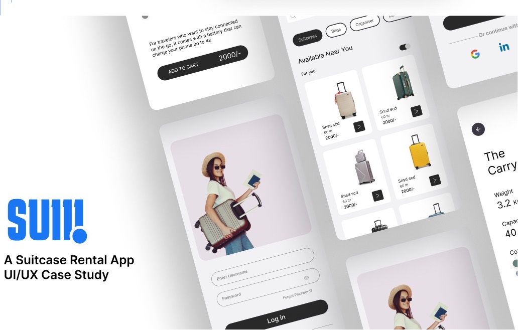
The idea
Travelers buy expensive things they use once: a hard-shell suitcase, a carry-on with a battery, a duffel for one trip. The purchase is a burden and so is the storage afterwards. SUII is a rental service that makes those items easy to get for a few days and easy to give back.
Research
I ran interviews and a survey around four questions: whether people had bought an expensive item for a single trip, how the effort of acquiring those items affected their travel, whether they would rent instead, and what would make a rental service worth using. The answers pointed at two things, storage and cost, more than at the products themselves.
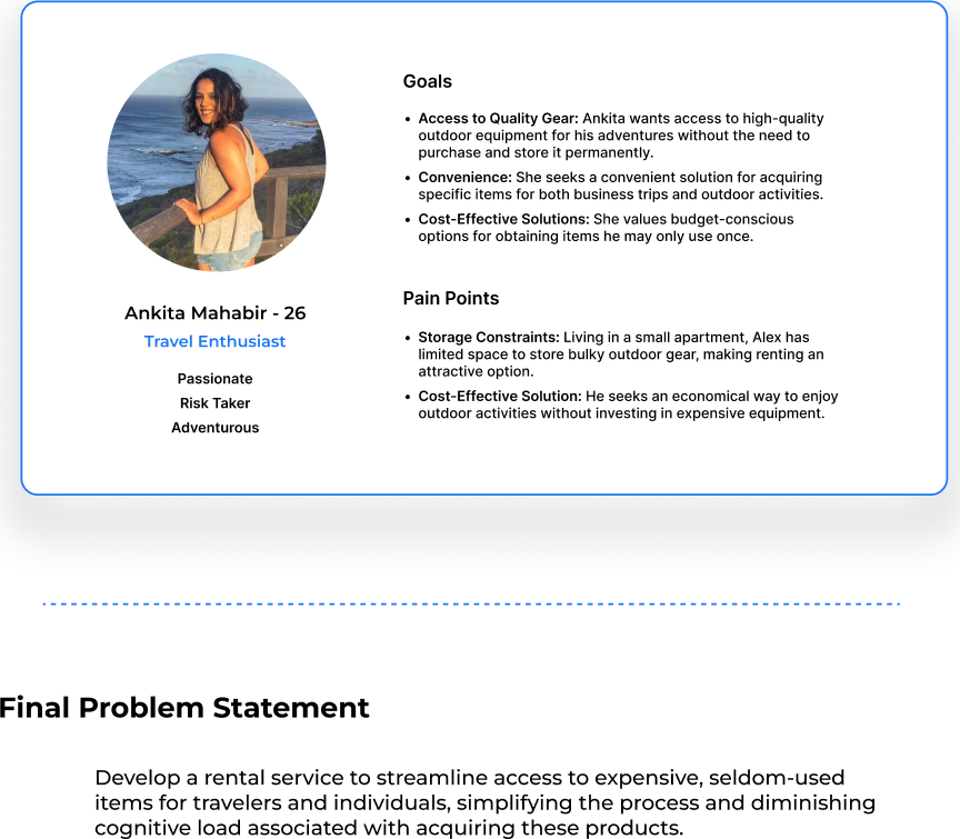
The problem statement: develop a rental service that streamlines access to expensive, seldom-used items for travelers, simplifying the process and reducing the cognitive load of acquiring them.
Decisions
Wireframes before visuals
I wireframed the main screens first to get feedback on the flow before any styling, which caught the biggest flaw early: the booking calendar had been buried two taps deep.
Onboarding that gets out of the way
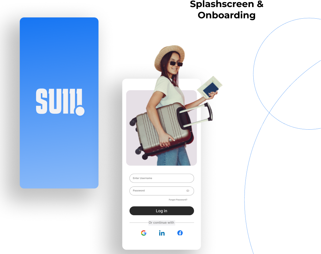
A splash screen, a login with three sign-in options, and you are on the store. Nothing to configure before you can look.
Browse like a store, read like a spec sheet
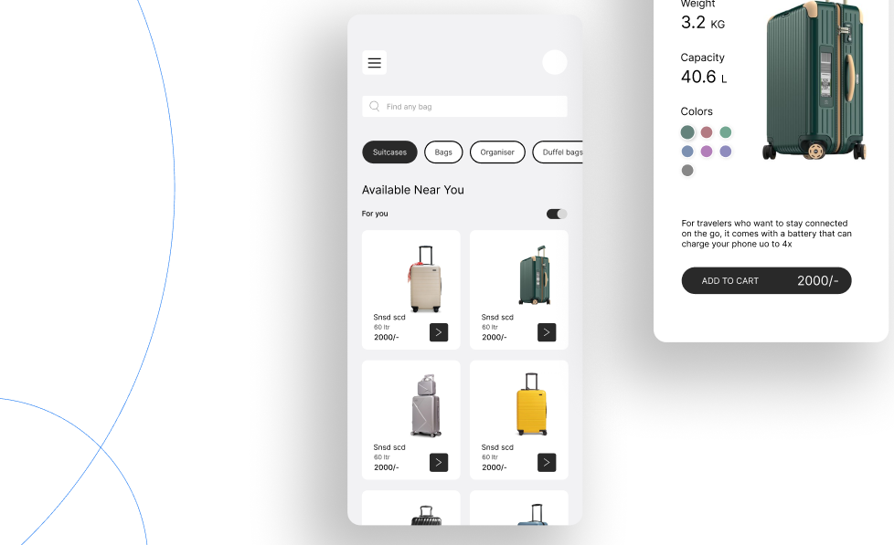
The home page filters by suitcases, bags, organizers and duffels and shows what is available near you. A product page reads like a spec sheet: weight, capacity, colors, and the one detail that matters for a traveler, such as a built-in battery.
Dates first, then a map
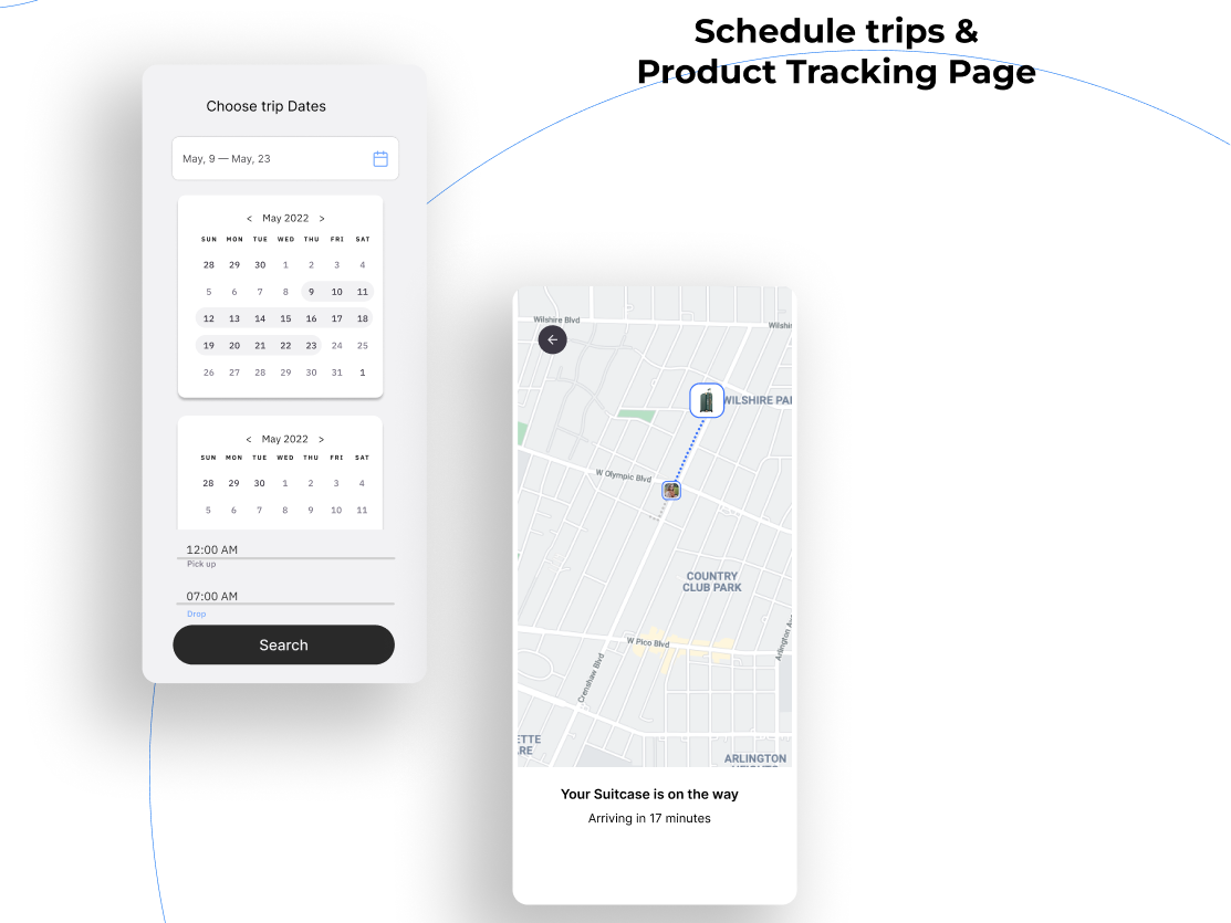
Booking asks for the trip dates and pickup and drop times on one screen. After that the app is a tracking map: your suitcase is on the way, arriving in 17 minutes.
What I would do next
Test the booking screen with five travelers and watch where they hesitate. Then decide whether pickup and return should be delivered or collected, which the concept leaves open.